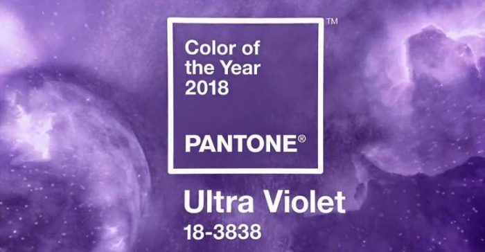
Pantone
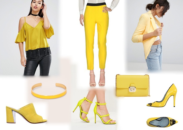
Color trend: Yellow | Shopping Guide
As you might know, yellow is having a comeback this spring/summer. Primrose yellow is actually one of the colors Pantone announced in their Spring 2017 Fashion Report. We don’t usually see it in clothes and accessories much, but this has to change, because look how nice it looks on them; it makes any outfit brighter. It goes perfectly well with black or white, but of course you can combine it with other colors as well, like orange, blue, pink, red, to create a nice colorblock outfit. Or you can even wear it head to toe to create a total monochrome yellow look. That would also look amazing. No matter the combinations, it will definitely make your outfits stand out, and we totally recommend you try it!
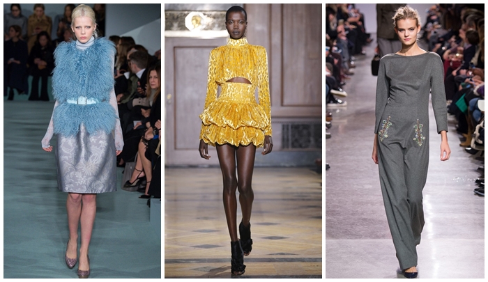
Pantone colors for fall 2016
September.. The month that you are so sad about because the summer is officially over, but at the same time you are super excited for the new season! Pantone is here once again to show us the new fashion colors for fall 2016. For vivid red to natural taupe, let’s take a closer look at the colors.
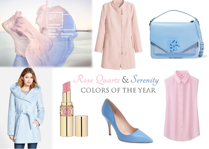
Pantone colors of the year 2016 | Shopping guide
Have you heard? Pantone announced the colors of the year recently (yes, you heard right, it is colors, not one color only), and I couldn’t be happier with these choices. The names of the colors are Rose Quartz & Serenity, and they’re pastel pink and pastel blue hues, which I personally love. Inspired by these two colors, I decided to search for similar colored items, to get you into spring mood. It’s still early but we really can’t wait. And who can blame us? Aren’t they gorgeous? You can shop for each of these items through the widget below.
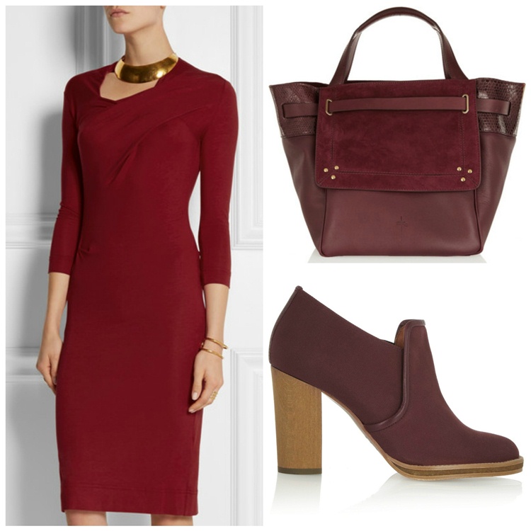
Marsala picks for spring
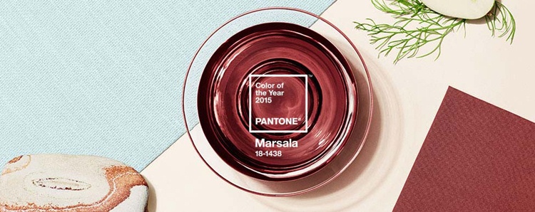
Pantone announces “Color of 2015” – Marsala
Pantone, the world renowned authority on color institution, has announced the “Color of the Year 2015” – it’s Marsala. In Pantone‘s words it’s “chocolate with an earthy red wine”. Pantone says it would be elegant to use it on its own or with other colors, as a strong accent. It’s a warm and a “seductive shade”, again in their words.

Written in English and Greek.
Click here to read more About Us


![Moschino [tv] H&M Fashion Show Moschino tv h&m fashion show](http://www.stylishlybeautiful.com/wp-content/uploads/2018/10/Moschino-tv-hm-fashion-show-9-198x132.jpg)

